SXSW 2011 festival

SXSW Music, Film, Interactive festival, March 11–20, 2011“But will they have free drinks?” That cry will be heard throughout Austin during the SXSW festival, from March 11 through 20. But of course we all have our different reasons for attending. Filmmakers, technology geeks, and live music enthusiasts alike can get their mojo on.

Wednesday through Saturday, the Austin Convention Center will house the 29th annual Flatstock poster show and the Texas Guitar Show. Flatstock has the latest in screen-printed poster designs, and promises to have a “portable” printer on-hand to show you how it’s done. Both shows are free to the public.

Interactive design firm Frog Design will host its annual SXSW kickoff party March 8. Industry peers will gather for a night of revelry and conversation.

And, oh, the music! I will be attending mostly day shows. Wednesday the 16th… Neo soul boys Fitz & The Tantrums will play a free show in the Waterloo Records parking lot. Texas’ own Bad Sports will play a day show at Trailer Space Records. Two interesting bands feature at Red River Street goth club Elysium: tough and tight garage rockers The Woggles, and Japanese punk crazies Peelander-Z. San Francisco’s Thee Oh Sees will be at Spiderhouse on the drag. Draft beer emporium The Ginger Man will have three great Texas bands: Ugly Beats, Thunderchiefs, and Eve & the Exiles. On the east side, newly-opened pub The Grackle will host “Gracklefest”—four days of free shows. Do not miss Flesh Lights, an Austin trio led by that young bolt of lightning Max Vandever. Two more must-see Austin bands OBN IIIs and my soccer mate Alfonso’s band, Manikin, will be at Beerland. Thursday the 17h… Poet, survivor, lover Kacy Crowley will open for The Sour Notes at Betsy’s Bar downtown. Soul shouters Black Joe Lewis & The Honeybears will dominate another free parking lot show at Waterloo, and then later at the Mohawk. I love the twee-ness that is The Carrots, and they’ll appear at the east side’s Baby Blue Studios. For $10 you can see former 13th Floor Elevators legend Roky Erickson and pals including Peter Buck from R.E.M. at Threadgills. For me a SXSW highlight will be UK band Pete And The Pirates at British pub Dog & Duck. On the same stage are The Minus Five, featuring former members of R.E.M. and The Dream Syndicate. Friday the 18th… Last year I spent some time on the beautiful grounds of the French Legation Museum. This year electroclash hell-raisers !!!, Cults, and tUnE-yArDs are my picks. The Shangri-la is a cherished east side neighborhood spot, and local boys done good The Hex Dispensers will be a good reason to stop by. Two festivals ago, I witnessed Gentlemen Jesse And His Men perform a scorching set in a record store parking lot. This time, the men will be outside at the Mohawk—not to be missed. South Congress Avenue shouldn’t be left out, and tiny outsider art gallery Yard Dog will somehow manage to find space for former X frontwoman Exene Cervenka to perform. Two excellent indie rock bands—Okkervil River, and Surfer Blood—perform at Flamingo Cantina. If you remember 1980s punk rockers ALL, their former singer is now fronting a band called Drag The River, and will be performing a few shows around town: at Hole in the Wall, Liberty, and Barbarella. Saturday the 19th… “Gracklefest” continues with Peelander-Z, 8-bit electro nerds Anamanaguchi, and my friends Cody, Zach, Nick, and Weston from Austin punk rockers Lost Controls. Rainey Street is fast becoming an alternative for dining and entertainment, and Okkervil River and Tapes ‘n Tapes will grace Lustre Pearl’s patio stage. Sunday the 20th… The last day of the festival goes out with a bang at the Side Bar. Flesh Lights, former Guided By Voices guitarist Doug Gillard, and two garage bands, Austin’s Ugly Beats and Pittsburgh’s Cynics will bring the house down.

For the most accurate, complete, and up-to-date SXSW music listings, I urge you to visit Showlist Austin.
A good match: Pantone and fashion

Pantone spring 2011 colorsGraphic designers and printers have used the Pantone Matching System for ages. But many people don’t often realize how vital Pantone is to the fashion industry. To coincide with New York’s Fashion Week, Pantone released its top 10 color report for spring 2011 women’s fashion. Designers and fashion houses such as Badgley Mischka, Tommy Hilfiger, Adrienne Vittadini, Betsey Johnson, and Project Runway winner Christian Siriano read the report and chimed in with their take on the colors.

One notes at first glance the absence of primary colors. And many of the designers latched on to “Honeysuckle,” a bright red-pink hue dubbed color of the year. But who are the people who select these colors? Answer: as most things are decided—by committee. A top secret committee of 10 people meet in Europe twice a year at the invitation of Pantone, a company based in Carlstadt, New Jersey.

Pantone designer David Shah, who presides over the meeting, said he seeks opinions from a broad range of industries. “I have people who work in the car business, who work with big store groups,” Shah said. “I can’t tell you the names. They’re involved with everything from furniture through to clothing and knitwear.”

Pantone’s main business is color standards. There are 1,925 colors in Pantone’s library of textile colors, each with a unique identifying number, and the familiar swatches. This number is used to communicate color standards so that graphic designers and their printers, or fashion designers and their textile manufacturers, are on the same page.

Why Ginny’s Printing rocks

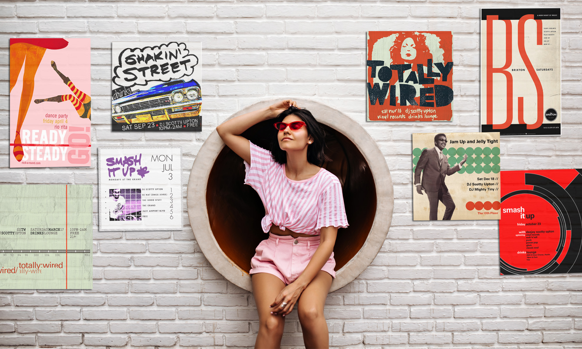
Ginny's Printing, Austin, TXAs a seasoned graphic designer, I have dealt with a number of different printing companies, even some in Asia (not by my choice but at the client’s insistence). Some printers are routine and faceless, others are reliable, and then there’s Ginny’s Printing. In the past two years, I’ve used Ginny’s for a few different clients. The latest job, however, was a simple poster of a short run for a DJ night. I spoke with Roland, my usual CSR, and he told me about a deal Ginny’s runs for Austin musicians on the front page of its website. Fifty 12 x 18″ full-color posters on heavy stock for $17.99+tax (shipping included), the catch is, there is no bleed and you must order either 50 or 100. No proof, and no CSR involvement. Ordering and file transfer is done through the site, as well as payment by credit card. I used my company credit card, typing my name, followed by the company’s (as it appears on my card). Apparently, this threw a wrench into the works, as there was an error prompting me to contact Ginny’s. I called and spoke with the financial department, and then, something extraordinary. The CFO of the company followed up on my call. She personally shepherded the order through the press department, and expedited the credit card problem. Turns out, my name followed by company name was longer than the online ordering system would allow. Simple database mistake. “Does not compute.”

I received a nice email from the CFO, with just about everyone from Ginny’s CC’d. But the story gets better. Someone from accounts called me Friday afternoon to tell me the job was complete, and that I could pick it up. I told her go ahead and ship it. The job was received FedEx Saturday! (Warning: FedEx shipping may NOT be included with all orders. Please consult before ordering.) I’ll remind you, folks, this was a $19 order!

I am telling everyone I know, shouting from the highest mountaintops, Ginny’s rocks with extra bass! (And besides, Ginny’s founder Michael Martin’s favorite cartoon character is Foghorn Leghorn. Well, DUH…)

7 great typefaces

Type selection can be a daunting process for designers. As a result, many have at the ready a few Teflon choices. What follows is a list of seven such typefaces (sorry, paring down to five was too difficult) that most designers will agree may never go out of fashion.

Helvetica
The subject of a feature film documentary, Helvetica makes the list despite its ubiquity. Originally created in 1957 by Swiss designer Max Meidinger, over the years a staggering array of variations (condensed, compressed, extended, expanded, etc.) have been added to the family. Excellent for conveying information clearly and quickly.

Clarendon
A slab, or square serif typeface, originally created 1845 by English designer Robert Besley, Clarendon was one of the first faces to be officially registered. Used extensively by the German Empire during World War I and more recently adopted by the U.S. National Park Service for its signage. Acclaimed for its uniform, heavy lines and legibility, Clarendon has proved its worth to designers everywhere.

Avenir
Relatively new on the scene (1988) and designed by Adrian Frutiger, the name Avenir means “future” in French. With nods to Futura and Erbar, the typeface is decidedly humanist—casual yet elegant. Excellent in business applications for both display and text.

Gill Sans
Inspired by his early apprenticeship to London Underground typeface designer Edward Johnston, author and designer Eric Gill created his first typeface around 1926. It was adopted heavily by the London and North Eastern Railway system, appearing on signage and in advertising throughout Britain. In 1997, the BBC adopted Gill Sans as its corporate typeface. Gill Sans is equally at home in print or on computer screens.

Franklin Gothic
Versatile when set for body text, billboards or newspaper headlines, American designer Morris Fuller Benton’s Franklin Gothic became hugely popular in North America and Great Britain thanks to its strikingly solid appearance. Franklin Gothic is the official typeface of the Museum of Modern Art in New York.

Myriad
Known primarily for Apple Computer’s widespread usage of it, Myriad was designed in the early 1990s by Robert Slimbach and Carol Twombly for Adobe. Clean and legible, yet playful with an easy-going sophistication, Myriad adapts to a variety of environments and concerns.

Futura + Futura Extra Bold sample
Extremely simplistic with a geometric form, Futura was designed by Paul Renner and commercially released in 1927. The distinctive extra bold face was added in 1955. No doubt Renner took cues for Futura’s design from the German Bauhaus school of art and architecture who employed similar type styles. Today, logos by Adidas and Absolut Vodka take inspiration from Futura, and a commemorative plaque left on the Moon in July 1969 features text set in Futura.

Did I leave out your favorite? Leave a comment and let me know why.

5 terrible typefaces

There are various reasons for qualifying a typeface as terrible for use in professional design. Some are overused, illegible, ugly, excessively cute, or a combination thereof. The following are the five worst, painstakingly ranked (and sure to be avoided) by yours truly.

Courier
A monospaced slab-serifed typeface designed in 1955 and originally intended for electric typewriters, whenever I see Courier used in print, I imagine the designer or printer failed to provide the proper font and Courier was its replacement by default. Handy only for computer coders who need columns of aligned text.

Monotype Corsiva
The de facto choice when a lazy designer/printer wishes to add some “elegance” to a business card or invitation. Illegible and clunky. Must resist.

Brush Script
Designed in 1942 and it looks it. Illegible. Vulgar. For added fun, try using it in all caps.

Papyrus
Since the 1990s, Papyrus has been made available to just about every computer in the world. And its use has exploded. I am sure poor Papyrus designer Chris Costello never intended text to be set at 12 point size! Film director James Cameron damned the torpedoes by famously using a variation of the typeface for his Avatar movie poster. Unfortunate.

Comic Sans
The “best worst” typeface ever, and a product of Microsoft. This casual and “cute” typeface designed by Vincent Connare in 1995 is the ultimate in amateurishness. There is even a movement to ban Comic Sans. Avoid using it, even if designing a comic!

Runners up were Curlz MT, Lazybones, Times New Roman, and Arial. Did I leave out your favorite? Leave a comment and let me know why.